We "went walkabout" over the past several years, largely deserting the precious metals sector for other greener pastures, because it has been performing so poorly, apart from a dramatic flurry during the first half of last year. However, the latest charts suggest that a major bull market is incubating in the sector and that it won't be much longer before it starts. This being so it is time for us to return to take positions ahead of its commencement.
We will now proceed to look at the latest long-term charts for gold, silver, precious metals (PM) stocks, and also the dollar, to identify the signs of the impending major bull market in gold and silver.
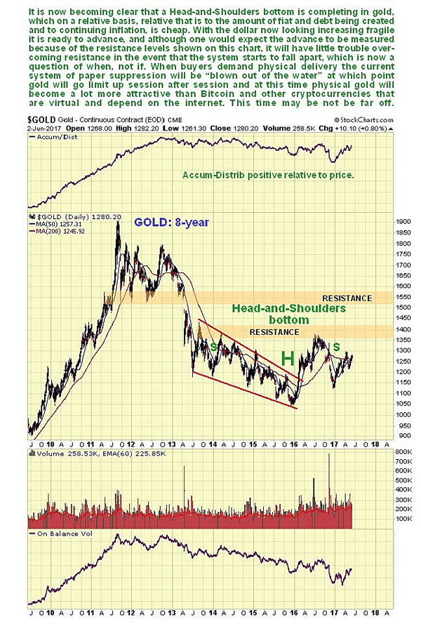
On the 8-year chart for gold, it is now becoming apparent that a large head-and-shoulders bottom is completing. This started to form way back in 2013, so this is a big base pattern that should lead to a major bull market. Given what is set to go down in the debt and derivatives markets, it should easily exceed earlier highs. With the benefit of this long-term chart we can also put the sizeable run-up during the first half of last year into context—it was the advance to complete the "head" of the head-and-shoulders bottom. We can also readily understand why it then gave back about half of these gains—it dropped back to mark out the right shoulder of the pattern. The good news is that, with this late stage of the pattern now approaching completion, we can look forward to more serious gains soon. The new bull market will be inaugurated by the price rising above the first zone of resistance shown, although it will then have to contend with another major zone of resistance in the $,1550 area. However, if the credit markets are coming apart at this time, this shouldn't prove to be much of an obstacle.
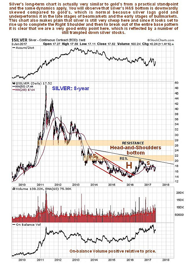
The 8-year chart for silver is quite similar to that for gold, as one would expect, except that it is skewed downward because silver tends to underperform gold during the late stages of sector bear markets and the early stages of bull markets. But it certainly looks like a good entry point for silver and silver-related investments here, with it still only $4 off its lows.
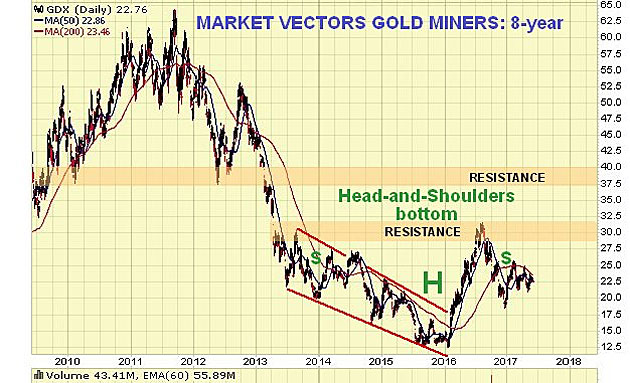
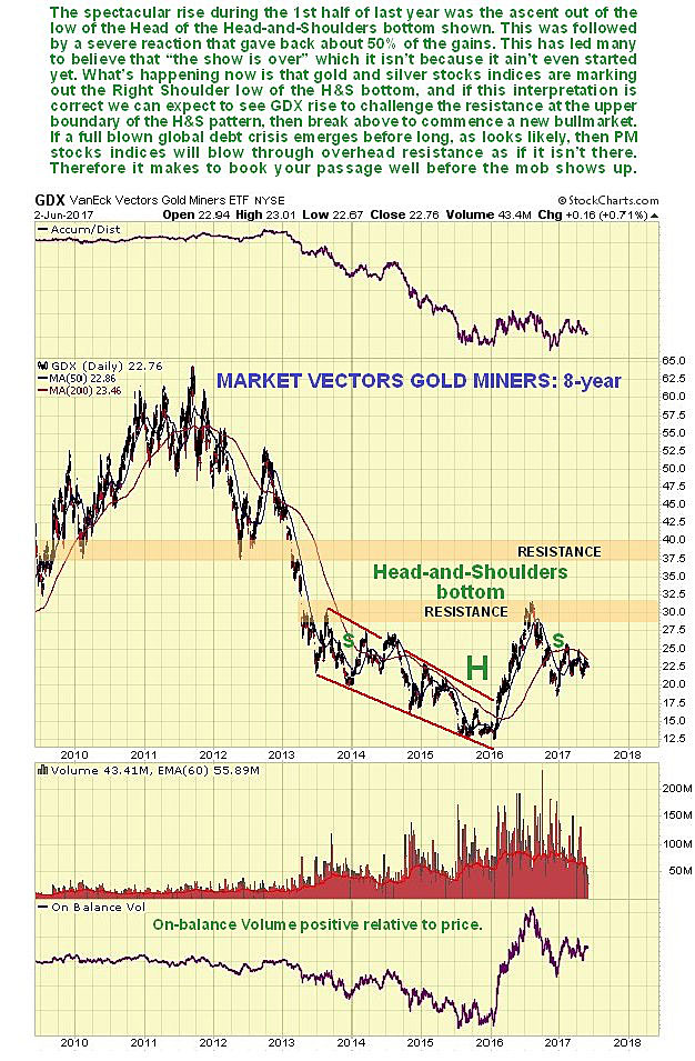
The 8-year chart for the PM stocks index proxy, GDX, also looks very similar to that for gold, except that it is somewhat upwardly skewed, which reflects the wild excitement of speculators in this sector once they sense a turn. There was a really big percentage gain during the first half of last year as it came off a really low level but, as with gold, GDX was rising to complete the head of the head-and-shoulders bottom pattern. Once it had done so a reaction set in, which saw stocks lose about 50% of their gains before stabilizing, with this reaction serving to mark the right shoulder of the pattern. Now it looks ready to advance up to the neckline of the pattern to complete it, and set the stage for the nascent bull market to come. Just this part of the advance will result in big gains in many trampled-down stocks, some of which we will be looking at in a separate article.
Despite the down-sloping moving averages, there is evidence of coiling on the 6-month GDX chart. This, combined with the suspected bull flag of the past couple of weeks, could lead to a surprise strong rally soon. . .
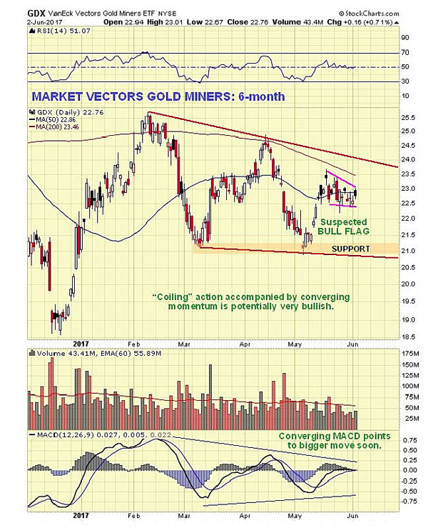
Many are expecting the sector to weaken again, citing the falling 200-day moving average on the indices, poor seasonals until the end of June, and an expectation that the dollar will rally from oversold. With respect to these factors it is worth pointing out, as regards the falling 200-day moving average, that the high values at the peak around last August will soon drop out, causing it to flatten, especially if we see a rally. Second, the poor seasonals are a background influence, and did not stop the sector from advancing during June of last year. Third, as we will see, the dollar looks like it is tipping into a severe decline, oversold or not.
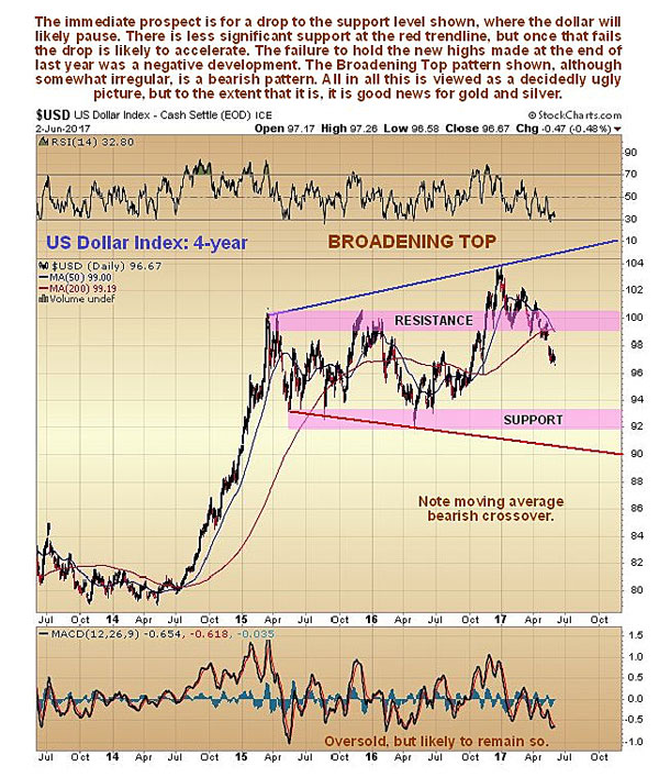
On the 4-year chart for the dollar, we can see how the it broke out above resistance to new highs on euphoria over Donald Trump's election victory, but it was subsequently unable to hold on to these gains, and has slumped back into the large trading range. This is a bearish development, particularly as the entire pattern from early 2015 now looks like a giant bearish broadening top. Having broken down back into the pattern, and below its 200-day moving average, which is rolling over, it now looks like it will continue lower, to the key support level at the bottom of the pattern as a first stop, despite its already being significantly oversold. If it breaches this support there is some support lower down at the red trend line, which marks the lower boundary of the broadening top. But if it breaks below that, things could quickly get a lot more serious.
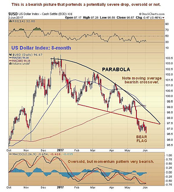
On the 8-month chart for the dollar index we can see recent action in much more detail. This is an interesting chart, for it shows that the dollar has been weakening beneath a parabolic trend line that is forcing it lower at an accelerating pace. There has been some talk about it forming a minor base here over the past week or two, and rallying from oversold, but it doesn't look like that is going to happen. Instead, the small, tight pattern of the past week to 10 days looks like a bear flag that will lead to another steep drop, and it started to fall quite hard again on Friday. Such a move can, of course, be expected to lead to gains in the precious metals sector.
Should we see the usual seasonal dip in the precious metals sector during this month and possibly into July, it won't alter the Big Picture set out here, and it should be seized upon as a buying opportunity, although what we are seeing in the dollar now suggests that the seasonal dip may not happen this year.
Clive Maund has been president of www.clivemaund.com, a successful resource sector website, since its inception in 2003. He has 30 years' experience in technical analysis and has worked for banks, commodity brokers and stockbrokers in the City of London. He holds a Diploma in Technical Analysis from the UK Society of Technical Analysts.
Want to read more Gold Report articles like this? Sign up for our free e-newsletter, and you'll learn when new articles have been published. To see recent articles with industry analysts and commentators, visit our Streetwise Interviews page.
Disclosure:
1) Statements and opinions expressed are the opinions of Clive Maund and not of Streetwise Reports or its officers. Clive Maund is wholly responsible for the validity of the statements. Streetwise Reports was not involved in the content preparation. Clive Maund was not paid by Streetwise Reports LLC for this article. Streetwise Reports was not paid by the author to publish or syndicate this article.
2) This article does not constitute investment advice. Each reader is encouraged to consult with his or her individual financial professional and any action a reader takes as a result of information presented here is his or her own responsibility. By opening this page, each reader accepts and agrees to Streetwise Reports' terms of use and full legal disclaimer. This article is not a solicitation for investment. Streetwise Reports does not render general or specific investment advice and the information on Streetwise Reports should not be considered a recommendation to buy or sell any security. Streetwise Reports does not endorse or recommend the business, products, services or securities of any company mentioned on Streetwise Reports.
Charts courtesy of Clive Maund.