"We are at the edge of a major economic crisis. Our monetary system is the underlying cause of this major crisis. The massive debt bubble created by our monetary system is about to burst. The demonetization of gold and silver, has over the years diverted value from these metals, to all paper assets (such as bonds) linked to the debt-based monetary system.
The process of the devaluation of gold and silver, started by the demonetization of gold and silver, is about to reverse at a greater speed than ever before. This is similar to what happened during the late 70s, when the gold and silver price increased significantly. However, what happened in the 70's was just a prelude to this coming rally. The 70's was the end of a cycle, this is likely the end of a major cycle; an end of an era of the debt-based monetary system (dishonest money)."
What this debt-based monetary system has done, is to create what I call a "mirror-effect", whereby, silver (and gold) is pushed down in value, to a similar extent as to which paper assets such as general stocks are pushed up in value. This mirror-effect clearly shows up on the long-term charts of gold, silver and the Dow.
Here (in part 2), I would like to show how this "mirror effect" of silver versus the assets linked to the debt-based monetary system (general stocks in this case), shows up on the long-term charts. This "mirror effect", also reveals an interesting cycle, which provides more evidence to support my view, of the impending judgment of this system (monetary system), in terms of standards according to the Holy Scripture.
Below, is a longterm silver chart (real and nominal) from 1850 to present (generated at minefund.com):
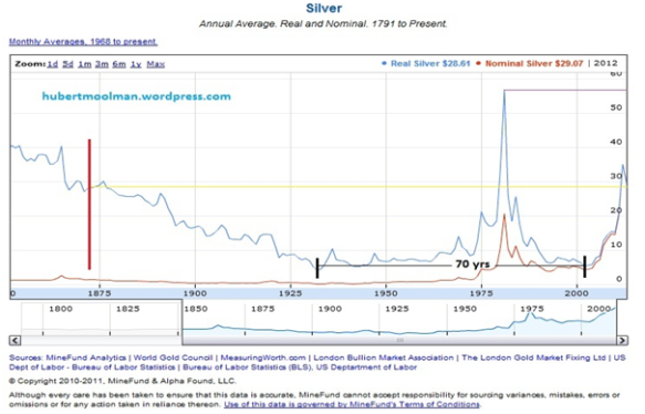
MineFund's real precious metals prices are deflated by U.S. consumer price inflation (Consumer Price Index-All Urban Consumers, not seasonally adjusted, January 2011 = 100).
I have drawn a vertical red line, approximately where silver was demonetized (1870s). Notice how the real price of silver collapsed after the red line, from about $30, until it bottomed in 1931 at $4.29. It then traded side-ways (from the big-picture view) for many years, until it spiked from about the early 1970s, making a peak in 1980, where after, it bottomed again in 2001.
Technically, the bottom in 2001 was the completion of what would be a remarkable double bottom reversal, with the first bottom being in 1931. After a double bottom formation, there is often a big rally, and that is exactly what happened next. If this pattern continues to follow the pattern of a valid double bottom, it will reach levels that will exceed the 1980 high by at least one multiple, but probably by many more.
However, the purpose of this article is not to deal with targets. The interesting thing about this possible double bottom is the fact that the two bottoms came 70 years apart. This 70 years period also appears on the long-term Dow chart. Below is a Dow chart (from stockcharts.com) from 1900 to present:
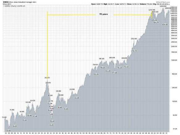
On the chart, I have indicated a 70-year period from when the Dow peaked in 1929, to the peak in 1999. The reason for using the 1999 peak instead of the 2007 peak, is the fact that the 1999 peak represents the real peak, since the Dow/Gold peaked in 1999 (like it did in 1929).
Notice the dates of the peaks and how they fit in with that of the bottoms of the real silver price, as well as the similar 70 year periods between. In my opinion, the occurrence of the 70 year period on both charts, in the context as explained above, provides additional evidence of the link between silver's demonetization (or suppression) and the massive debt bubble of this century as explained in part 1 of this article.
While the Dow is inflated to the peak in 1929, silver is suppressed to its low in 1931. And again, the Dow is inflated to its peak in 1999, while silver is suppressed to its bottom in 2001.
So, the peaks and troughs, as presented in the above charts, are the manifestation (in visual form) of the debt-based monetary system causing paper and related assets to rise, while suppressing silver. Another way of looking at it is that the debt-based monetary system is fuelling speculation in paper assets by using energy diverted from precious metals. THIS IS THE REAL MANIPULATION OF GOLD AND SILVER it is in the open.
Silver (like gold) stands in direct opposition to the current monetary system (they are inescapably linked). The fall (and falling) of this system is the rise of silver as money; therefore, massive increases in what silver can buy in real terms.
Update on the silver pattern presented in my previous article
In my previous article on silver, I presented the following graphic that compares the silver chart from 2007 to today, to the gold chart from 2008 to 2010 (all charts generated at fxstreet.com):
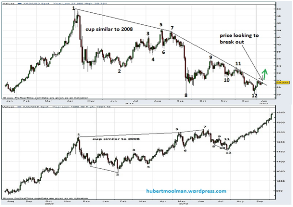
It seems that silver has now made that low at point 12 (note, there is still a possibility of a retest). Price is now looking to break out of the down-trend since September (point 7). If silver continues to follow gold's pattern above, we could see new all-time highs over the coming months.
For more of this kind of analysis on silver and gold, you are welcome to subscribe to my free newsletter or premium service. I have also recently completed a fractal analysis report for gold and silver more detail on my website.
Warm regards and God bless,
Hubert
http://hubertmoolman.wordpress.com/
[email protected]