The Consumer Loans figure shows an impossible jump of $360 billion in a one-time change in April 2010, in the dashed blue line. Just graphically you can see that the jump is not consistent with history. The correct conclusion is that consumers didn't go on a $360 billion borrowing binge in one month. The change was from how the Fed reported the data. In other words, the "green shoot" of apparent loan growth in the first chart is bogus. It came from a fluke in the data that couldn't have happened, and so it didn't happen. We don't have evidence of recovery in loans but rather continuing their decline since the beginning of this recession in 2008.
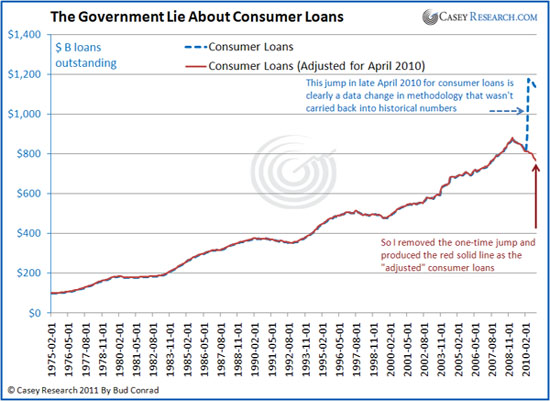
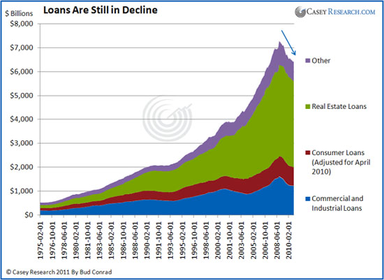
To get a consistent view, I adjusted the data from April forward to remove the jump to produce the gradually continuing decline as shown in the solid red line. Without the one-time change in the data from the Fed, the loans at banks have continued to decline.
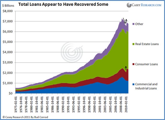
When combined into the big picture, the result is that the private sector is still deleveraging its outstanding balance of loans.
The rate of decline is still at the biggest level since World War II. . .
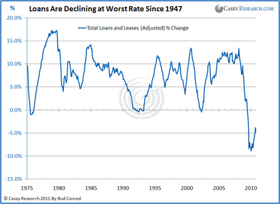
My interpretation is that the private economy is still in a downturn because the Federal Reserve numbers, when adjusted as I provide here, are still showing we are in the worst decline on record. Not shown here is that government debt has been soaring, contributing to other positive economic numbers but leaving us with a debt burden for the future. I think the economy is weaker than the general consensus of economic reporters, because they haven't looked as closely at what is inside the numbers.
To get a big-picture view of where the economy is headed, read our FREE special report The Good, Bad, and Ugly: Outlook for the Economyauthored by the editors of The Casey Report. 20 pages of deep economic insight you can't afford to miss: Click here to read it now.